

This third edition of Cycling On-Chain takes a closer look at bitcoin’s ongoing supply squeeze and recent short squeeze.
Cycling On-Chain #3: Lemonade
Dilution-proof, August 1, 2021
Cycling On-Chain is a monthly column that uses on-chain and price-related data to better understand recent market movements and estimate where we are in bitcoin’s larger market cycle. After providing a broader look back and forward in the first edition, and discussing how Bitcoin has entered the geopolitical stage in the second edition, we’ll now take a look at the current, ongoing supply squeeze that recently led to a short squeeze in the bitcoin market that drove prices up steeply.
The last three months have been pretty rough for bitcoin from a price perspective. You could make a good case that, fundamentally, things have never looked better. But a period of over-leveraged speculation and (mostly irrational) fear in the markets have left their mark — particularly on the newer market entrants. Those times might be scary but are actually where the wheat is separated from the chaff or, in bitcoin terms, the weak hands are shaken out and the bitcoin ends up in strong hands. These HODLers of last resort don’t budge when price drops a double-digit percentage, but rather see it as an opportunity.
When life gives you melons, make lemonade – Elbert Hubbard, 1915
Lemonade. That is what this third Cycling On-Chain is all about. Times have been tough, but there are currently all kinds of squeezing going on that ensure that much of the available bitcoin supply will end up in strong hands in preparation for the next micro-, meso- or macro-cycle.
Squeezing Supply
A supply shock, sometimes also called a supply squeeze, is an event where the supply of a product or commodity that is actively being traded on the market changes and causes a price move. In Bitcoin, the halving events that occur every 210,000 blocks (roughly every four years) are the most famous supply shocks. During a halving the new supply issuance via the block rewards that miners receive when creating a new block is halved, triggering a large price increase in the subsequent year that is known as Bitcoin’s four-year cycle.
Bitcoin’s halvings are programmed into the software, but a supply shock can also occur when previously illiquid supply becomes liquid or vice versa. It is therefore interesting to assess to what extent supply is in the hands of entities that are or are not selling.
Using the data in the Bitcoin blockchain, it is possible to look at the ages of all the unspent transaction outputs (UTXOs) that have ever existed. Glassnode analyzed these “coin ages” and found that roughly 155 days is a historic cut-off point when the probability of a UTXO being spent becomes very low. Based on this, they created metrics for the short-term holder (STH) and long-term holder (LTH) supply.
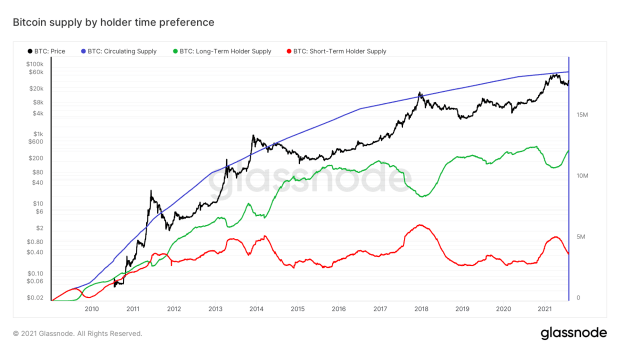
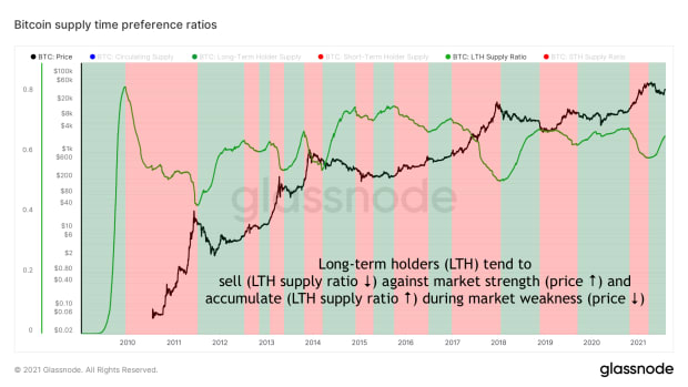
As is evident, the STH and LTH supply fluctuate over time. An easier way to view the historical data is to divide the LTH supply by the circulating supply, which then represents the portion of the circulating supply that is estimated to be in the hands of LTH.
This Long-Term Holder Supply Ratio is displayed in the green line in Figure 2. The green color overlays represent periods in which the LTH Supply Ratio rises, which usually occurs during market downturns where price (black line) decreases or bottoms. The red color overlay shows the opposite: LTH Supply Ratio usually decreases when price rises, illustrating that long-term holders tend to sell against market strength and accumulate during market weakness. Long-term bitcoin holders are therefore usually seen as “smart money.” Being able to follow their economic behavior via the blockchain may hold valuable information about the state of the bitcoin market.
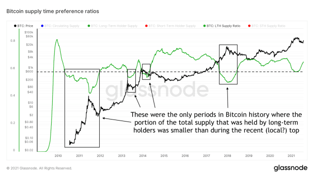
The LTH Supply Ratio also allows us to compare how current values for the portion of the total supply that is held by long-term holders compares to historical values. Figure 3 illustrates that the lowest LTH Supply Ratio reached during this latest $65,000 market top was not as low as those reached during previous market cycle tops. Of course it does not have to reach these levels, but shows that if $65,000 does end up being a larger macro market cycle top, it was characterized by lower LTH sell pressure than previous market cycle tops.
Since the Bitcoin blockchain is a public ledger, it is also possible to forensically assess to what extent unspent transactions come from or move to certain types of entities, such as exchange wallets. While this is unfortunate from a privacy perspective (make sure to check out @BitcoinQ_A’s privacy guide to learn how to optimally deal with this yourself), it allows Glassnode to improve upon the STH and LTH supply metric.
Using a proprietary algorithm to apply clustering based on forensic analysis of Bitcoin’s UTXO set, they created metrics for the illiquid, liquid and highly liquid supply. For the remainder of this column, the latter two are combined as “liquid supply” to keep the analysis simple.

If you compare the original STH and LTH supply (Figure 1) with this illiquid and liquid supply chart (Figure 4), you’ll see that the changes in the latter are much more nuanced. This is likely the result of the applied clustering, as young UTXOs can still be held by illiquid entities with little to no history of selling.
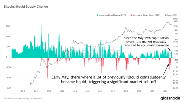
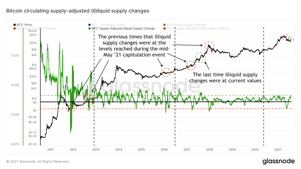
Therefore, it is more helpful to look at the monthly net changes within these metrics, which is what Glassnode offers in their “Illiquid Supply Change” and “Liquid Supply Change” metrics. Figure 5 displays the illiquid supply change over time. The large amount of previously illiquid supply that became liquid around early May is clearly visible here, as well as the illiquid supply increases that have returned since the May 19 capitulation event.
Because the bitcoin supply is increasing by every block and these increases are changing over time due to the halving-based supply issuance schedule, these values cannot be accurately compared to historical values. After all, a 200,000 bitcoin illiquid supply decrease was much more impactful when there were only 2 million bitcoin circulating (10% of the total) than it would be when there are 20 million coins circulating (1%).
This problem can be solved by dividing the illiquid supply by the circulating supply, creating a metric called the circulating supply-adjusted illiquid supply changes,” which is displayed in Figure 6. During the early years, the illiquid supply increased massively, a lot of which was likely related to coins being forgotten about or lost, as well as some of the early HODLers stacking sats before that became a thing. The relative illiquid supply decrease seen during the recent market downturn was the largest since the 2017 market cycle top, which was preceded by two more similar episodes during that bull run. The current illiquid supply increase is also the largest since mid-2017, before that cycle reached its final blow-off top.
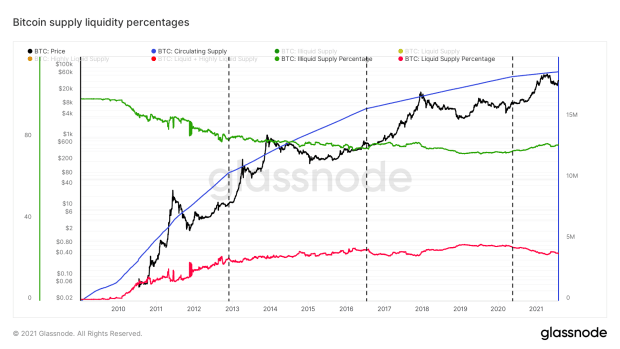
Recently, Will Clemente and Willy Woo introduced the “illiquid supply ratio,” a metric that is calculated by dividing Glassnode’s illiquid supply by liquid and highly liquid supplies. An alternative version that is best labeled as “illiquid supply percentage” can be calculated by dividing the illiquid supply by bitcoin’s circulating supply. The latter metric therefore represents the portion of the circulating supply that is currently labelled as illiquid by Glassnode. Likewise, the liquid supply percentage can be calculated by dividing the liquid supply by the circulating supply, representing the inverse of the illiquid supply. Both metrics are displayed in Figure 7.
Next we’ll zoom in on the illiquid supply ratio percentage, which is visualized in figure 8. After Bitcoin’s genesis almost all of the bitcoin supply was considered illiquid, as network participants were CPU mining on laptops and desktops and mostly just toying around with the new software. When bitcoin started getting a market price and saw some early adoption as a neo-money, a larger portion of the supply started to become liquid, as these coins could now actually be spent. During the earlier years miners also may have been selling their newly mined bitcoin to cover overhead costs — especially after the introduction of GPU mining and later ASIC mining.
Figure 8 also shows that after each Bitcoin halving (vertical black striped lines), the rate of contraction in the illiquid supply slows — even turning into a positive growth rate immediately after the last two halvings. More simply put: as the bitcoin supply issuance declines and it becomes scarcer, its holders appear to become less and less inclined to part with their bitcoin. Will the low 70% illiquid supply ratio percentage that we saw during the previous bear market be the lowest ones that will ever be reached in Bitcoin’s existence?
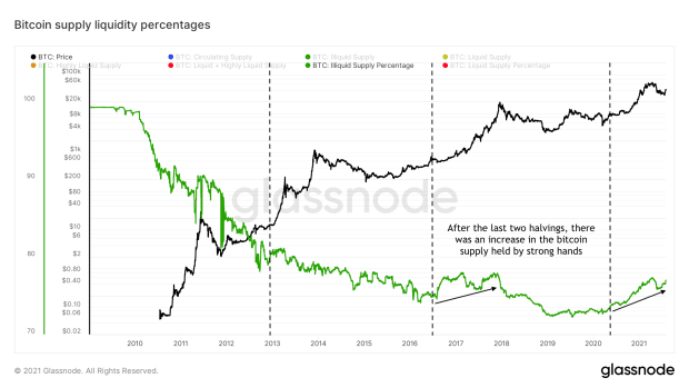
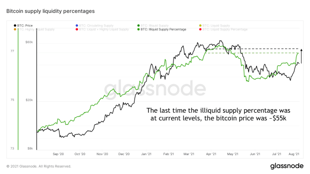
Figure 9 shows this same illiquid supply ratio percentage, but zooms in on the last year. Since the start of July, the illiquid supply ratio percentage increased drastically, as coins were being scooped off the market at a discount by holders with a history of being strong hands. Current illiquid supply ratio percentage values haven’t been seen since the bitcoin price was hovering just below all-time highs at around $55,000. This short-term trend suggests that the recent dump is now over and a new supply squeeze may be underway.
Squeezing Shorts
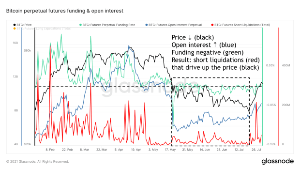
The supply wasn’t the only thing being squeezed recently. Since the May 19 capitulation event, the bitcoin price has been in a downward consolidation and market sentiment was predominantly bearish. Bitcoin Twitter was actually so salty that you could mine salt by scrolling through the responses under the tweet of any on-chain analyst. This was also noticeable in the funding rates of bitcoin perpetual futures contracts that were mostly negative since then, which means that shorting bitcoin was so popular that you would basically need to pay a premium to go short. The increasing open interest since the May 19 capitulation while funding stayed negative further substantiates this.
These circumstances lined up to be ideal for a short squeeze to occur. A short squeeze happens when a relatively large portion of the futures market is going short with inappropriate risk management and a sudden price increase causes the collateral under these positions to become insufficient, triggering exchanges to liquidate these positions. This is particularly troublesome if a large portion of the open positions are naked shorts, which means that they use a different form of collateral to borrow the asset they’re shorting against. In the case of bitcoin, when fiat currencies or stablecoins are used as collateral for a short position that is then liquidated, the fiat or stablecoin collateral is used to buy the bitcoin that is needed to pay off the debt, which actually drives its price up further.
This is exactly what happened over the last two weeks. Figure 10 illustrates that since the May 19 capitulation event, price declined (black) while open interest (blue) increased, as funding remained negative (light green). When price resiliently bounced off the recent $30,000 lows, open interest actually increased further at increasingly negative funding, showing that the bears were basically doubling down. However, the bitcoin price just kept surging, liquidating a large number of these naked shorts, creating an over $10,000 price move over the course of about a week.
Squeezing Out The Weak Hands
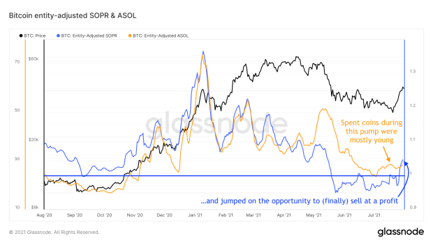
During this recent bounce off the lows, the Average Spent Output Lifespan (ASOL) per entity on the network remained low, which means that the coins that moved on the bitcoin blockchain throughout this period were mostly relatively young. The Spent Output Profit Ratio (SOPR) per entity on the network did increase though, illustrating that the coins that were moved did so at a profit. This combination of trends is visualized in figure 11 and suggests that younger market entrants that were sitting on underwater positions might have jumped on this opportunity to sell some of their positions at a profit. This is once again an example of coins moving from weak-handed entities with low conviction to strong-handed new owners.
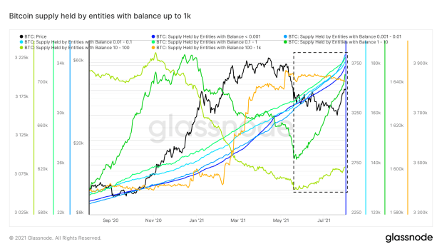
When using terms like “smart money” and “weak hands,” we tend to consider institutional players to be the former and retail investors to be the latter, but this is not necessarily the case. Figure 12 displays the bitcoin supply that is held by entities with balances up to 1,000 bitcoin and shows that entities with balances of up to 1 bitcoin have been rigorously stacking sats throughout this entire bull run and never had a significant selloff. Entities with a balance between 1 and 100 bitcoin were selling portions of their stack since bitcoin broke its prior $20,000 all-time high until the May 19 capitulation event. But these smaller entities have been accumulating again since then. Entities with a balance of 100 to 1,000 bitcoin were mostly stacking when the bitcoin price neared its recent all-time high and have mostly sat on their positions ever since.
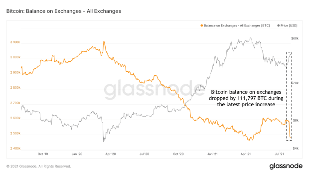
By definition, whenever there are buyers there are also sellers. On average, entities with balances up to 100 bitcoin were accumulating throughout the recent market downturn. They were therefore slowly depleting the highly liquid supply that was actively being traded on the markets, as we already saw in the illiquid supply changes. Since this last bounce off the $30,000 lows, almost 112,000 bitcoin have been withdrawn from exchanges (Figure 13), adding fuel to the fire that we may be in the midst of another supply squeeze.
A Not-So-Sour Sentiment
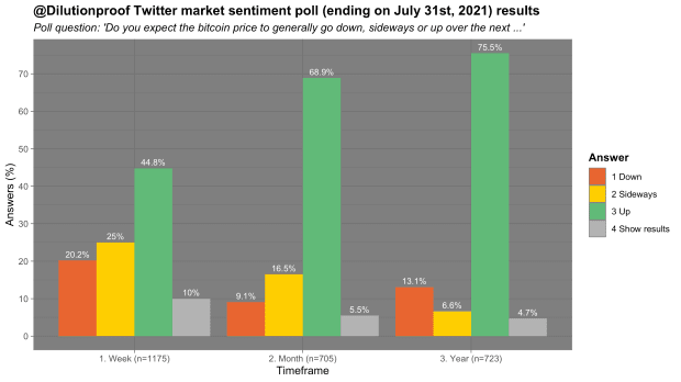
The recent market turnaround seems to have had a noticeable impact on the market sentiment as well. In an informal monthly market sentiment poll, respondents were very clearly bullish on all timeframes, as can be seen in figure 14.
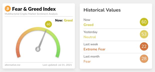
These poll results appear to align with the Fear & Greed Index that scrapes multiple social media platforms and algorithmically assesses the sentiment in bitcoin-related posts. Throughout the recent downwards price consolidation it consistently signaled very high levels of fear and anxiety, but has now actually flipped to greed for the first time in a while (Figure 15).
During the last few months, an often-heard criticism of on-chain analysis was that it does not predict the future. While this is true, increased insight into what is happening under the hood of the system certainly helps us understand how the bitcoin market functions. Relatively unexpected events such as Elon Musk or Tesla suddenly speaking negatively on Bitcoin or China suddenly cracking down hard against it can impact the market at any point. However, these types of events occur during each four-year halving cycle, so zooming out and looking at the larger picture may be helpful in navigating the larger trends.
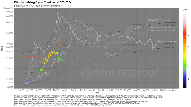
Several models have been developed to do so and use statistical approaches to predict the global direction of where the bitcoin price is headed, such as the S2F and S2FX models. Other indexes extrapolate price increases throughout previous halving cycles over the current period. Each of these approaches have their own methodological limitations, but together they provide a nice overview of where price may be heading if history either repeats or rhymes (Figure 16). On average, the bitcoin price was following those anticipated courses nicely throughout the current halving cycle, but has dipped below most of these models during the recent market downturn. Will this cycle end up being the one that breaks down several of these models to the downside or will the apparent ongoing supply squeeze drive up this cycle’s price in line with its predecessors?
Previous editions of Cycling On-Chain:
Disclaimer: This column was written for educational, informational and entertainment purposes only and should not be taken as investment advice.
This is a guest post by Dilution-proof. Opinions expressed are entirely their own and do not necessarily reflect those of BTC, Inc. or Bitcoin Magazine.


via bitcoinmagazine.com
